Friday 29 January 2010

From Film to Song to Film to Book

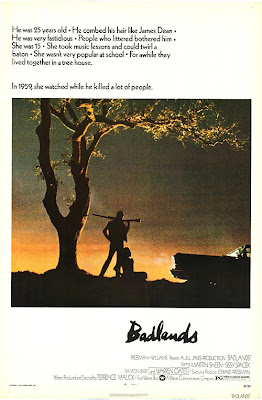
January 21, 1958, Charles Starkweather and his partner Caril Ann Fugate went on a Killing Spree through Nebraska USA. This story inspired a well known film.....

'Badlands'(above), directed by Terrence Malick, made in 1973 and based on a true story about a young couple who go on a killing spree in the badlands of Nebraska.
I enjoyed this film when i watched it about one year ago, don't remember much about it and would have to watch it again to talk more about the film side to it.
Terrence Malick Directed and also wrote the script for this, he was obviously Intrested by the story and inspired to write this film. Malick looked at real things that had happened the world to get inspiration for his writing.
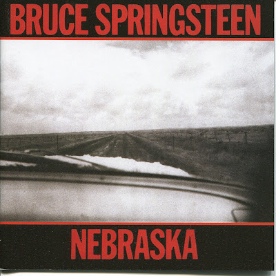

From seeing the film, a well known musician went on to write a song about the story seven years later. Bruce Springsteen released a solo album called Nebraska (above) in 1982, the title song was inspired from the story of Starkweather and also the film 'Badlands'. Springsteen was always inspired to write songs from watching films, he loved American B Movies and the whole of his Born to Run Album was suppose to represent an American Style B Movie.
Two of his songs were names of films, one from his 1975, Born to Run album, called 'Thunder Road' (A Robert Mitchum Film) and also 'Badlands' From his 1977 album, Darkness on the Edge of Town.
So Springsteen was also getting ideas for his job from the world around him, just like Terrence Malick was.
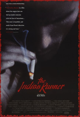

Sean Penn's film directing debut came in 1991 with his film 'The Indian Runner' which was based on the song 'Highway Patrolman' from the 1982 Nebraska Album. I can't buy it anywhere, so I've not been able to watch it., but still i managed to watch bits of it on YouTube and reminds me of the setting from the song.
Sean Penn was inspired by a single song to make a film, this how effective music can be.


Lastly a book was released in 2005 by a writer called Tennessee Jones called 'Deliver Me From Nowhere' (above) which was inspired by all the things I've talked about, Nebraska Album, The Indian runner, Badlands and Starkweather. Its a book that is literally a cover album but in book form. Its short stories on each song from the album, it takes the original stories from the songs and elaborates on them and goes deeper into the stories of the characters.

Generating ideas can come from everywhere by the looks of it, even from music which i thing is really fascinating, a 5-6 minuet song can be expanded to a 1 hour 30 minuet feature is very impressive for both the director for doing it and the musician who put so much detail into the original song.

Scary Bus Monster Face!

This is a Bannister holder upper, but it looks more like a scary, one eyed, big headed devil man. I see this everyday i come to uni on the bus and it always freaks me out!

What makes it scary is the glaring eye which is looking straight at you, also the darkness around it gives it an evilness! Also, the mouth is almost smiling as if it knows something about you that it shouldn't!

As well as it being scary it also reminds me of the mask from the game'crash bandicoot' (his name is 'Aku Aku'). So really it looks like a Witch Doctor which adds to the scariness!

You can get ideas from just looking at things around you, from that image you can create a character with a personality which i think is awesome! I see things all the time (theres a character in lecture theater B!, he's the speaker on the wall, looks like a serious guard with one of those hats on from Buckingham Palace! look next time you are in there)

Wednesday 27 January 2010

The writers of Family Guy are Manatees?

Virtually what we've been doing but with manatees instead of students.

Watch from 10 minuets 30 seconds in!


What other ways are good to generate ideas? In my opinion, couldn't anything work? Obviously you can't just sit there waiting for an idea to pop up without a pen and paper! so what methods are there?

There's brainstorming/ mindmaps/ explosion diagram (mindmaps, in this 'P C' world we live in), everyones done a mindmap at some point and for me they never work, especially on my own. I just seem to sit there with the title of the brief in the middle with a circle round it and one line coming off it which goes nowhere.
Group ones work well because you have more people working on them, which means if you have no ideas to start with, but someone else dose, then you can expand on theirs.

This website below is saying the opposite to me (mindmapping alone is better than in a group) which goes to show that it doesn't work for everyone!

http://www.mindtools.com/brainstm.html

-------

Another website had a top 10 list of ways to generate ideas, one of witch was, carry a note pad everywhere you go, something you may see that inspires you might be forgotten if you don't write it down or take a picture of it. Then looking back at the note pad weeks, maybe years later, you might use it for something or it might branch out to create a story or a character ect.

This is the website (its number 10 in the list)
http://www.powerhomebiz.com/vol7/brilliantideas.htm

--------

The last website i looked at did a survey which came up with these results..

"I asked the group to tell me under what circumstances did they have their best ideas. Their responses really surprised me. Here’s what came up:

“When riding my motorbike”
“In the bath”
“When I’m on holiday”
“When reading fiction”
“While cycling”
“When I’m swimming”
“When I’m painting”
“When I’m deeply relaxed”
“When I’m playing with my children”
“At the Opera or a classical music concert”
“In the shower”
“When I’m out walking”

Notice anything really interesting here? Not one person said it was when they were working! I was stunned. I thought one or two people at least would have said their ideas came while at work."

So obliviously being in a working environment doesn't work as well as if you were doing stuff which relaxes you, something you like to do, Hobbies?

----------

You can also get ideas from events that mean something to you. Something personal to yourself could be a good start and could be expanded into a story.

Song writers in the 60's got inspiration for songs of the Vietnam war and the event that happened in America because of the war, like the Draft, which meant many Americans from the age of 16? had to go and fight in the war. Also Crosby, Stills, Nash and Young had a successful folk/rock song called 'Ohio' which was in response to the Shootings at a university in Ohio during the Vietnam War.


Tuesday 26 January 2010

My Christmas Wrapping Paper

This year (last year?! 2009) i was surprised by how good the wrapping paper was on my presents, reminded me of the title sequences for old 50, 60's cartoons.

Click on it to make it HUGE
Even the colours are nice, very pastely.

cheers mum

Monday 25 January 2010

Rear Window

Started getting very board of the hitchcock dvds, i've watched too many of them for now and want to have a change, but the last one i watched last night was a real good one.

Rear Window kept me amused for just short of 2hours evern thought its shot from one room in an apartment. The story & the convocations they had just made me want to watch more, whilst some of his other films like 'Marnie', I had to watch in 2 half's as i got too board.
Whats nice is that you see nothing more than the main character sees in his room (he's stuck in his room because he broke his leg), he becomes obsessed with watching what the neighbors are doing in the other apartment blocks.
At first you only see f
rom far away so you can't really make out what people are doing in there rooms, but once he gets in to the stalking, he gets his binoculars out and you start to see whats happening in much more detail.
I felt really cramped whilst watching it because you never leave this guys apartment, its a lot like the film 'Phone Booth' in that respect, which brings the viewer into the movie and you stay in the movie the whole way through.
The only bit of relief you get from the apartment is seeing through his binoculars.....like this (below)


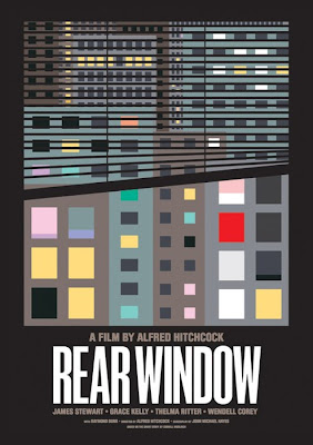
That poster at the top of the post is an alright poster, but this one below is awesome.

I find this poster (above) so much more interesting, it answers no questions and is visually easy on the eye. The film was made in 1954 and it fits in lovely with the animation style that was going through changes in the 50's from realistic look to a very abstract look. Its very neat and is structured nicely but is broken up by the wonky blind which gives the poster balance. Plus having the dodgy blind suggests something is weird will happen in the film, if it was straight that you would thing nothing shocking would happen in the story, but the slant makes you think other wise.

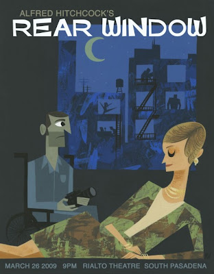
Lastly, i found this poster which was made recently, some person made it for some random reason (something about a party he was having?!?!?!) but anyway, i like it a lot.


Like the 50's abstract look this is very similar, things like; only showing one eye, big noses, using straight lines instead of curves and the gouache painted background look. Even the type face reminds me of the 50's.

Sunday 24 January 2010

CSNY

This is a CD cover for the band 'Crosby, Stills, Nash and Young', there are a few things i like about it;

1. I love how it flows, there is no ending to the drawing, which is kind of nice as its title is 'So Far'. Also, the way it flow and is very free has its resemblances to the peace and love of the 60's.


2. The drawings of their faces are so simple, one of them (far left) is just a out line, but resembles 'Crosby' very well. Its a lot like the profile of Hitchcock which i think he did him self, its a very good drawing / sketch and points out the features that make it hitchcock. like the fat cheeks and the way his mouth hangs out (i'm gonna milk Hitchcock facts as much as i can, whilst I'm still watching the box set!).


I find it fascinating how people are able to so a persons profile from just a few lines. Looking at the far right of the top picture again, 'Young', the facial expressions are just perfect especially on the mouth. The eyes are blacked out which is how he looks.

Picking out features of people and exaggerating them to an extreme helps people recognize who it is, its used all the time in newspaper cartoons.


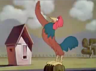
Pointing out his big ears and big mouth we know its Tony Blair (or Prince Charles!), during World War 2 Disney did Properganda cartoons for the US against The Nazi Rayshem, this picture below is from one of their cartoons where Donald Duck is in Nazi Germany and he is brain washed with Nazi things.


The house is Hitlers face, the reason why we recognize it is because of his slick forward black hair at the front (shown as a shadow on the house) and also the mustache, which is shown by the window and the blind not gong all the way down.


...What was i talking about?

Wednesday 20 January 2010

Match.com


Saw this advert in Edinburgh at new year in a pub, and being in a pub, its hard to hear stuff as sooo many people are speaking and sometimes there is no sound on the tv either.

Watching one of the documentaries on Hitchcock, someone said about Hitchcock making the editors or anyone in production watch scenes, from the film they were working on, with no sound. The reason for this is to see if you follow whats happening and if people start getting confused then he knows that something isn't working, and would cut unnecessary bits that might drift away from the story.

So, going back to the the Match.com advert, i watched it with no sound and what was nice was that i was interested in it because it was an animation (not knowing it was for match.com). I could see that it was some sort of love story as the emphasis was on the blond hair girl and the ginger bloke, i could also see it was over a period of time because the weather kept changing, so there was no confusion there.
I think its quite a strong advert and would not of expected it from a dating sight!

Now i don't like to watch it with the sound on :(

(also, took me till now to find the videos on youtube)

This is another one........ love the style on both of them and keeps to a nice colour pallet all the way through.
I like this one better as its a bit more clearer who's involved, the tension between them is lovely and some of the things they to to avoid eye contact is genius, someone must be very observant to notice these things in everyday life and its been portrayed very well by the animators.

Tuesday 19 January 2010

Thats the Magic of Movies

The best thing about Christmas time is the sales, i bought 'The Alfred Hitchcock Collection' for £14.99 (its now £17! WTF!). I don't know how good the collection is as i hadn't seen any of them when i bought it, got good reveiws though!
I've now seen the first two; 'The Birds' & 'Family Plot', thought they were pretty good, especially 'The Birds' and whats nice about all of the DVD's is it comes with 'the making of..' (in the special features), which guides you through the whole film and shows you how things were done and the reasons why shots were used and stuff.

This clip is from the documentary on 'The Birds' which i thought was a very good point.


(Video seems to be out of sync with the sound on my computer?!?!?)

I watched the film first, then the documentary and i to thought nothing of it, i just believed he opened a real door.
So we have Sound (although it didn't mention sound, there was a door opening sound which leads you to think a door is really there) and lighting to thank for that!

Thursday 14 January 2010

Marlon Brando, Pocahontas and Me

Went to go and see Avatar yesterday, thought it took a while to kick in, but once it did it was pretty amazing.
Special effects were really good, someone or where told me it was like, 60% CG and 40% live action (could be very wrong). But putting aside the action and the effects, there's a good story....

....whilst watching it i noticed that the story and what happens in the film relates to the Native American Indians and there experiences with the US government, i won't say more as it might give away what happens in the film plus i don't know a lot about the history behind American Indians.

The only reason why i noticed this is because of a song by Neil Young called 'Pocahontas' which is all about American Indians, Young is related to American Indians in some way and sings about them in quite a few of his songs. Also Marlon Brando did a lot of work to help them get there right in the US. I looked but couldn't find any connection between American Indians and James Cameron thought.

So yer, avatar wasn't just a 3D spectacular, but had a strong message even if it was subtle.

Wednesday 13 January 2010

Old Boy - Colour

I watched the 2003 film 'Old Boy' a few night ago, its a Korean film about a man who is kidnapped and imprisoned for 15 years, then let out to find out why he was kidnapped in the first place. Very Good film and is now making me want to watch more world cinema films as i never watch them.

While watching any film now, i can't help but pick up on the things we've been taught, like colour, viewpoint etc. in the films. Old Boy had a nice colour pallet which was use through out the film.


This is were the main character is held captive, whats nice is the colour is divided into the rooms, a nice warm colour for the main room and a cold blue/green for the toilet. Blue, Green and Red are the main colours used in the film.


Wall paper is keeping with the style of the film, subtle, but necessary.


The lighting is emphasizing the colour in this composition, plus it has virtually the same colours as the first image on this post.


Purple is used later on during the film, i think it represents memories, as the things that are helping him to remember why he was captured seem to be purple. Like in this image, the photo albums are all Purple.


This is a flash back, the main character starts to remembers something from the past, i noticed that its lit in purple.


Lastly, this box holds the twist to the the film, it's also a Purple box, as it will make him remember something.


During the credits, it pans across mountains, whats clever is the sky has the colours of the film, Blue, Red and Green.

Tuesday 12 January 2010

Tar Boy

!!!!!!TARBOY WATCH!!!!!!
(watch before reading)

This is one of the best flash animations I've seen in ages on Newgrounds, its done be semi-professionals people but still got a lot of praise (anyone can upload to newgrounds, but people don't like companies uploading as they take the lime light off students work)

There is some really good animation in the short, the robots mining the caves is a good example, they really show that these robots are holding a huge weight in the way the body moves. giving more frames to the lifting of the weight and less to the hitting action.


They also used some special effects (after effects?????) which works well (music goes well with it, in that particular scene & the twist of the neck is very nice!) also reminds my of the Film Noir style during that scene.

Special Effects, lasers n' sparks


Film Noir Like..


Monday 11 January 2010

***Codeing Reasons, for assessment***

*****this is on an e-mail as well (from my mum's e-mail address), as i couldn't e-mail you from my e-mail address, tried on the 27th of December and again when you e-mailed us today******

The reason why i chose to make a cereal box decorated in my findings was because i grew up on the television adverts that advertised cereal and it seemed the right thing to do from my point of view.

I then researched the characters who advertised these adverts (and others) and how/when they were created, which took me back to 1920's, but they weren't at there peak till around the 50's and i love the styles of characters in the 50's and 60's animation, and the advertising characters were just the same. I also like the colors and typefaces they use which gave me the idea of doing this cereal box in a 1950's style.

I added quotas from a book i have called 'Meet Mr Product' which has lots of the characters in America that advertised products in the 50's, 60's ect. the quotes i used were meant to show how these characters brain wash kids into wanting there products.

Lastly i added my photos from New York and some screen shots of the adverts from television (from you tube) to the bag the cereal normally comes in to make it more like a cereal box.

Wednesday 6 January 2010

First Choice


This advert caught my eye today, its advertising holidays for the company 'First Choice'. What I noticed is how strong the contrast is between the different scenes (one in the kids pool & the other in the adult pool)

They have used very fast cuts and different angles in the first scene (kids pool) and also used lots of sound of children screaming and the underwater noises, this puts you on edge and makes you feel uneasy.

Then they give us a lovely sigh of relief as it cuts to the adult pool where its one shot the whole way through which is easy on the eye and looks visually interesting, also there is no sound only a bit of Foley which is nice and peaceful.

Use of camera and sound gives this advert the impact which it wants on the veiwer

Tuesday 5 January 2010

Stolen from Jack Maguire


Watched this video after seeing it on Jack's wall and wanted to pick up on a few things....

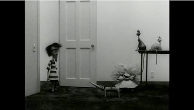
1. Reminds me of the 'Dr. Caligari' film, with its slanty buildings and staircases which is Tim Burtons style, so he's obviously got influence from German expressionism.

2. Having Vincent Price narrating the short
makes the animation and style so much more better, his voice is so soft yet very sinister at the same time which goes well with this character who is a nice friendly boy but wants to be evil at the same time.

3. Me being a big fan of Brad Bird (director of iron giant, The Increables) i've watched a cartoon called 'Family Dog' which was part of the 'Amazing Stories' program which was set up be Steven Spielberg, then became a spin off show. Brad Bird was the director of the family dog cartoon and Tim Burton was the exclusive producer, what i found from watching 'Vincent' was that two of the characters (sister and dog) in Vincent share similarity to two characters in 'Family Dog'.

The dog share the same long pointy nose and the eyes and size are quite similar


The sister has round shoulders in both and has the same round face, also the bottom half is a more triangle shape in both.


Can't help but think that he had somthing to do with the character design as well!

Monday 4 January 2010

Research

These two clips show how much research Pixar put into each of there films, there talking about Ratatouille in this, but it goes for every film they make.
The amount of detail they go into to make sure the film is believable is pretty mind blowing.


Saturday 2 January 2010

Evian Roller Babies

An advert to watch which has picked up more than 15 Million views on youtube, called Evian Roller Babies. It's Very funny and gets people talking about a product which is quite a boring one!


Looking back at other adverts to do with water, another company which did something random and funny was 'Drench', which had Brains from Thunderbird's dancing to a 90's dance tune.


Its obviously difficult to sell Bottled water to the public because firstly its boring and secondly we could easily get a glass from the tap after watching the advert, so making something random and memorable should hopefully mean next time your out of the house and want some water you will buy there brand.