I was lucky enough to have a one to one portfolio crit with Daniel Greaves at his studio 'Tandem Film'
I was pretty nervous to say the least, but I got so much out of it which will help towards my FMP and my views on where I'm going in my professional career.
I got near enough the same feed back on both my Feelgood and Train animation as Beakus gave me which only highlights the fact that I really need to consider timing in my work whilst taking into account what the piece of work is for.
He had a real good scrub through the feelgood piece and pointed out the design, like beakus, is really good and went on to say the characters feel like they belong to the environment you've designed. He was very careful with his words and didn't want to say things which weren't true which I admired, the overall feedback on my work and how I approach it was that the design of my work is very impressive and is working to my strengths.
What was good about showing my animatic for my FMP is that Daniel made me scrub through it and explain what was happening after he'd watched it through once. No one's ever asked me to do that, they've just tried to understand it and given me feedback which might not even apply. Once Daniel understood the piece he was able to give some really good feedback. As a result of the feedback (from both visits) I've made a new animatic with added shots which gets the story across better.
I showed a style test of how I wanted the piece to look, again, he liked the design of the animation. He said it seems I've got a lot of work to do if you want to get it all up to that standard!
What I've learnt from the visit is that design is a major strong point in my work and work needs to be done on my storytelling.

Showing posts with label Competition. Show all posts
Showing posts with label Competition. Show all posts
Sunday, 25 March 2012

Protfolio Visit | Beakus
Me, Jack Maguire and John Hind went to visit Beakus studio last Wednesday whilst in London, arranged by John, I showed three pieces of work to Steve Smith and Eleni O'Keeffe who kindly took the time out to see us.
I showed my Train Animation and Feelgood, the main bit of feedback I got, which applies to both, was that their too long for what they are. Feelgood should be shorter because it needs to be short and snappy as its advertizing a product whilst the Train Animation should be cut due to its lack of story. I've been told this a few times now, and as a result I'm making sure my FMP is the right amount of time for what it is.
It was said for both pieces that my design work is really good. This was nice to hear as its something I've been working on to improve.
Lastly I showed my FMP animatic. It was really hard to do, as I had to sit there and explain the concept and it always makes me embarrassed, but I think its essential to do it and I just have to get over it.
It was good to show though, as I got a fresh pair of eye on it. The main thing brought up by Steve and Eleni was that there needs to be more of a reason for the Kid to scare the Bear, which is something I never considered, but it makes perfect sense now. I few suggestions were given which I went away and thought about and have now added to the animatic. Its added more work, but i think its work which is essential to the story.
Aslo, showed this piece which I did with jack. We described what it was for and why we did what we did. As a result they both understood it and had no comment on it...which was a good thing!
I showed my Train Animation and Feelgood, the main bit of feedback I got, which applies to both, was that their too long for what they are. Feelgood should be shorter because it needs to be short and snappy as its advertizing a product whilst the Train Animation should be cut due to its lack of story. I've been told this a few times now, and as a result I'm making sure my FMP is the right amount of time for what it is.
It was said for both pieces that my design work is really good. This was nice to hear as its something I've been working on to improve.
Lastly I showed my FMP animatic. It was really hard to do, as I had to sit there and explain the concept and it always makes me embarrassed, but I think its essential to do it and I just have to get over it.
It was good to show though, as I got a fresh pair of eye on it. The main thing brought up by Steve and Eleni was that there needs to be more of a reason for the Kid to scare the Bear, which is something I never considered, but it makes perfect sense now. I few suggestions were given which I went away and thought about and have now added to the animatic. Its added more work, but i think its work which is essential to the story.
Aslo, showed this piece which I did with jack. We described what it was for and why we did what we did. As a result they both understood it and had no comment on it...which was a good thing!
Sunday, 20 November 2011
Colour Tests for Competition Brief
One thing which I feel I've made more of an effort to do in the 3rd year is make sure the colour in my animations look reasonably good, or visually ok. I really enjoy thinking about colours for my animation, taking into consideration all the different things which will essentially make up the animation; the mood, the style, target audience etc...
The company 'Feel Good Drinks' already have a colour scheme and a style on there website, and although its good, i wanted to create something different which was my own, but still in keeping with their message.
To get inspiration for the colour i looked to my book shelf, which is ever growing. I homed in on the pixar 'art of' books and also one of the disney archive series volumes called 'Design' which showes off some fantastic works of art from the disney artists.

This was the first one I did (below), it was pretty dull, but were the colours I essentially wanted to use; Greens, Blues and Browns.


More Autumn looking...brighter colours, but its looking too realistic...

Birds n' all in this one...

I liked this one (below), but my problem with it was that it wasn't really the right colours for the brief. I imagined it more summery, I'd been rearing off into the autumn look too much.

This was looking less real and more stylized and the colours were much brighter in contrast to the first attempt. But I wasn't happy with the colour.

I got bored with the 'in a tree looking out' composition and decided to look at the tree to see if I could get any good colours out of it. I liked the green sky which was influenced by a few pieces of art i'd seen from my books of reference (which are shown below my image)


I finally settled for this....its bright enough and looks pretty spring/ summery. also I made the branches/ tree trunks a dark green and totally got rid of the browns, it seemed to work better. Now i needed to do this, but inside the tree where the animation will take place, and also consider the composition.

The company 'Feel Good Drinks' already have a colour scheme and a style on there website, and although its good, i wanted to create something different which was my own, but still in keeping with their message.
To get inspiration for the colour i looked to my book shelf, which is ever growing. I homed in on the pixar 'art of' books and also one of the disney archive series volumes called 'Design' which showes off some fantastic works of art from the disney artists.

This was the first one I did (below), it was pretty dull, but were the colours I essentially wanted to use; Greens, Blues and Browns.


More Autumn looking...brighter colours, but its looking too realistic...

Birds n' all in this one...

I liked this one (below), but my problem with it was that it wasn't really the right colours for the brief. I imagined it more summery, I'd been rearing off into the autumn look too much.

This was looking less real and more stylized and the colours were much brighter in contrast to the first attempt. But I wasn't happy with the colour.

I got bored with the 'in a tree looking out' composition and decided to look at the tree to see if I could get any good colours out of it. I liked the green sky which was influenced by a few pieces of art i'd seen from my books of reference (which are shown below my image)


I finally settled for this....its bright enough and looks pretty spring/ summery. also I made the branches/ tree trunks a dark green and totally got rid of the browns, it seemed to work better. Now i needed to do this, but inside the tree where the animation will take place, and also consider the composition.

Tuesday, 15 February 2011
Character Design | 14 | Bits I've Done Mixed into the Animatic
I've cut up the animatic, and put in the animation i've done so far, it looks good...I'm happy with it!
From this, i may need to scan in some of the animation's to a 1024 x 576 size. but some of them i can just zoom in on (like I've done...with the walk cycle)
I'm happy with the timing of the whole thing, and also the continuity...i think continuity is the right word, I'm talking about how he goes from the shot of him coming up (from putting the milk down) to then going into a walk.
______________________________________________________________________
After showing everyone in the class the video above, i got feedback in the form of post it notes.


From this, i may need to scan in some of the animation's to a 1024 x 576 size. but some of them i can just zoom in on (like I've done...with the walk cycle)
I'm happy with the timing of the whole thing, and also the continuity...i think continuity is the right word, I'm talking about how he goes from the shot of him coming up (from putting the milk down) to then going into a walk.
______________________________________________________________________
After showing everyone in the class the video above, i got feedback in the form of post it notes.
For some reason I got the impression everyone wanted me to add sound?


So, instead of carrying on animating, I'm going to add sound to the video for the hand in day. (but i will probably carry on doing the animation in my spare time :)
oh, and here's a drawing me n' john collaborated on

Saturday, 12 February 2011
Character Design | 15 | THE Animation
This is a break down of the second shot of this story...
So I started off by recording my self doing the action...
I studied myself doing the action, looking at where my foot turns to go back into a walk on the way back, how I balance myself etc etc...
Then...I did a rough version of how it would look (I didnt do any key frames or anything, just went from the first frame to the last)...big mistake, here's how it looked...
It looks wheeey to real and stiff. I had to push malc's body, think of what mood he's in and lastly do some key frames.
I started by making the first frame really exaggerated

Having him balance on one leg to start with meant that he's going to hit the ground hard, which firstly means less frames, but also, he wouldn't just stop suddenly stop after than, his arms would keep going.
Rick was telling me about thinking ahead of the key frame, it doesn't just stop there, the character would go and do something else, what ever action he/she was doing leaves a mark on the limbs that are free, so looking at the this key frame when his left leg finally touches the ground...

...i had to carry on the force of that left leg hitting the ground whilst also getting his right leg to start moving forward.
Here's the final result
I'm pleased with how it came out, and learned a lot along the way.
So I started off by recording my self doing the action...
I studied myself doing the action, looking at where my foot turns to go back into a walk on the way back, how I balance myself etc etc...
Then...I did a rough version of how it would look (I didnt do any key frames or anything, just went from the first frame to the last)...big mistake, here's how it looked...
It looks wheeey to real and stiff. I had to push malc's body, think of what mood he's in and lastly do some key frames.
I started by making the first frame really exaggerated

Having him balance on one leg to start with meant that he's going to hit the ground hard, which firstly means less frames, but also, he wouldn't just stop suddenly stop after than, his arms would keep going.
Rick was telling me about thinking ahead of the key frame, it doesn't just stop there, the character would go and do something else, what ever action he/she was doing leaves a mark on the limbs that are free, so looking at the this key frame when his left leg finally touches the ground...

...i had to carry on the force of that left leg hitting the ground whilst also getting his right leg to start moving forward.
Here's the final result
I'm pleased with how it came out, and learned a lot along the way.
character design | 14 | Animatic changes...again
After talking to rick, here's some other changes made...
1. the camera angle is looking up at malc's face from the phone now, rather than from malc's view point looking down at the phone. This also lead to me changing his reaction, he now looks round (as if he dosn't know who's phone is going off)
2. he looks down at his phone during the long shot (after the above shot)
3. instead of cutting from the long shot to the close up of Malc's eyes, now (because Malc's looking at the phone in his pocket) the close up also has Malc going from looking down to looking straight at the camera.
1. the camera angle is looking up at malc's face from the phone now, rather than from malc's view point looking down at the phone. This also lead to me changing his reaction, he now looks round (as if he dosn't know who's phone is going off)
2. he looks down at his phone during the long shot (after the above shot)
3. instead of cutting from the long shot to the close up of Malc's eyes, now (because Malc's looking at the phone in his pocket) the close up also has Malc going from looking down to looking straight at the camera.
Monday, 7 February 2011
Character Design | 13 | Animatic changes
Right, so the idea is that Malcolm's phone rings and he goes into a world of his own, where its like 'good, bad and ugly' and he's in a show down. Once he picks up the phone, he's got a missed call.
Here's the storyboard/animatic with notes on..
I'm doing two things at the same time really, I'm working out the storyboard/ animatic and also drawing ideas for how he will stand and what he will look like etc within the scene.
I drew this...

I liked the idea of exaggerating the 'putting hand in pocket' to get the phone, but up to now, the phone was on his belt, so i've changed it. Otherwise its going to look a bit drab, i think, i need to put some kick into him whilst he's in his imagination.
So here's the animatic/storyboard with extra stuff...
This is just over 30 seconds long, so it might have to be shortened...meaning this post was irrelevant.
Here's the storyboard/animatic with notes on..
I'm doing two things at the same time really, I'm working out the storyboard/ animatic and also drawing ideas for how he will stand and what he will look like etc within the scene.
I drew this...

I liked the idea of exaggerating the 'putting hand in pocket' to get the phone, but up to now, the phone was on his belt, so i've changed it. Otherwise its going to look a bit drab, i think, i need to put some kick into him whilst he's in his imagination.
So here's the animatic/storyboard with extra stuff...
This is just over 30 seconds long, so it might have to be shortened...meaning this post was irrelevant.
Sunday, 6 February 2011
Character Design | 12 | Tests
Before I'd finally picked a character, I did this walk cycle for Malc the Milkman.
Mike Evans's (from graphics) first words were "woh, he's striding", Mikes right, Malcolm's looking too confident in this walk cycle, he needs to look a little more...i can't think of the word, but i think its the arms which need to be sorted out. The arms need to be a bit more free and floppy, not so stiff and confident.
The walk cycle works and looks good, but its just not Malcolm.
Mike Evans's (from graphics) first words were "woh, he's striding", Mikes right, Malcolm's looking too confident in this walk cycle, he needs to look a little more...i can't think of the word, but i think its the arms which need to be sorted out. The arms need to be a bit more free and floppy, not so stiff and confident.
The walk cycle works and looks good, but its just not Malcolm.
Saturday, 5 February 2011
Character Design | 11 | animatic rough
For the 30 - 60 seconds of animation, i was thinking of showing a walk cycle a run cycle and some other stuff showing off what malc the milk man can do, plus a short story of how he imagines things.
This is an animatic of how malc would imagine things happening once hes watched a film or television program. In this case he's watched the spaghetti western film 'the good, the bad, the ugly', so what ever happens in the day, he'll make it seem western like, in this short, his phone has started to ring...
This was one of my favorites of all my ideas, looking at...
1. How Malc imagines things
2. Referencing a well known film
3. making it comical
I had other ideas for the western, but this stood out because it also mocks the way we wait for ages before someone, in the film, makes a move and shoots someone. And transferring that to how Malc imagines it happening and waiting so long that once he dose pick up his phone, its rang out.
This is an animatic of how malc would imagine things happening once hes watched a film or television program. In this case he's watched the spaghetti western film 'the good, the bad, the ugly', so what ever happens in the day, he'll make it seem western like, in this short, his phone has started to ring...
This was one of my favorites of all my ideas, looking at...
1. How Malc imagines things
2. Referencing a well known film
3. making it comical
I had other ideas for the western, but this stood out because it also mocks the way we wait for ages before someone, in the film, makes a move and shoots someone. And transferring that to how Malc imagines it happening and waiting so long that once he dose pick up his phone, its rang out.
Thursday, 3 February 2011
Character Design | 10 | Expressions
To animate a character, I've gotta have a good idea of what facial expressions he would pull in different situations.
I drew a neutral face on paper, it sounds easy, but i had to make this neutral face look convincing and believe and also not make him look to goofy and silly.
The neutral face (can be seen in the bottom image *click to enlarge*) looks boring, but it will emphasize the more exaggerated expressions he will pull once hes in his imagination.
I wrote down loads of different expressions, and picked out a few which i thought are 'classic' facial expressions. I then took pictures of me pulling these expressions (i really tried to exaggerate my face, so i can pick up on how the cheek looks when smiling, or what the eyebrows look like when angry.
I scaned in the neutral face and stuffed it into photoshop and made duplicates, the neutral face will also be used as the 'master head' so that the size stays the same in all the other expressions.


I drew a neutral face on paper, it sounds easy, but i had to make this neutral face look convincing and believe and also not make him look to goofy and silly.
The neutral face (can be seen in the bottom image *click to enlarge*) looks boring, but it will emphasize the more exaggerated expressions he will pull once hes in his imagination.
I wrote down loads of different expressions, and picked out a few which i thought are 'classic' facial expressions. I then took pictures of me pulling these expressions (i really tried to exaggerate my face, so i can pick up on how the cheek looks when smiling, or what the eyebrows look like when angry.
I scaned in the neutral face and stuffed it into photoshop and made duplicates, the neutral face will also be used as the 'master head' so that the size stays the same in all the other expressions.

so, this is my work space, looking at me on one side and encorprating it into malcolm's face on the other.

I also decided to think about colour as well, I don't plan on colouring the animation in, but I still want to know what he would look like in colour. (I saved the swatches I used, so i can go back to them at any time on any computer, plus i named them so i done have to remember!)
One thing that i do, is i tend to play it safe with colour. For example, i wanted to have the nose a different colour to liven his face up a bit, so i chose a really simmaler colour to his skin...but a tiny bit darker. It looked really boring and non adventurouse.
What colours do famouse character have to make them intresting?
Here's ren and stimpy, look at stimpy's nose, its in total contrast to the rest of his colour pallet.

Mines not that extrem, but I pushed myself to choose a colour that is away from the skin colour, i think it works well.
Also, the eye lids are a different colour :)

Here's the finished piece.
Next, Profile Sheet!
Next, Profile Sheet!
Tuesday, 1 February 2011
Character Design | 9 | Imagination
So, Malcolm (thank you Oriana!.....Oriana came up with his name) has the imagination of a kid, he see's things happening around him from what he's watched on t.v or at the cinema, but how can i cut from one to the other, and how do you know when its his imagination or real life etc.
One thing that i had in mind was to make all his expressions really exaggerated in the imagination, in comparison to the real life.
Heres a really really good animated short. I saw it a while back on 'cartoonbrew' website and loved it. Now its helping me work out where the imagination starts and when real life takes over.....
Love the camera angles and over exaggerated body lengths etc, but to focus in on the imagination side of things, I like the idea of building up to something, then just cutting back to the real world.
Another bit of inspiration which Rick Clapham pointed out to me was a 1960's film (became a television series as well) called Billy Liar...
This one below is fantastic...
One thing that i had in mind was to make all his expressions really exaggerated in the imagination, in comparison to the real life.
Heres a really really good animated short. I saw it a while back on 'cartoonbrew' website and loved it. Now its helping me work out where the imagination starts and when real life takes over.....
Love the camera angles and over exaggerated body lengths etc, but to focus in on the imagination side of things, I like the idea of building up to something, then just cutting back to the real world.
Another bit of inspiration which Rick Clapham pointed out to me was a 1960's film (became a television series as well) called Billy Liar...
This one below is fantastic...
Sunday, 30 January 2011
Character Design | 8 | Idea 61 Revisited
Ok, so, I went with the Milkman character as I thought it had more depth, and since I last spoke about him things have changes a bit!

Last time he was a milkman who imagines being a cowboy (as shown in an early drawing above), its now expanded into him being influences by what he watches on television and what he sees at the cinema, because that's what kids do...they go and see a film, then want to be like that character by acting like them for a day or two until they see something else (I'm sure loads of people did it after seeing the joker in dark knight...even you)

So this opens up more possibilities and isn't restricted to western references for example...
Here, he's just watched a war film (doesn't matter which war film for this sketch)

Here's a sort of treatment/ character in a nut shell...
Malcolm's dream job as a kid was to be a milkman, 15 years on and his dream had come true. He never lost his childhood spirit and his imagination is still as imaginative as it was when he was a boy. His love for film and television fuels his imagination and makes his job as a milkman much more exciting!
Here's some more of his development, not in any order...


Last time he was a milkman who imagines being a cowboy (as shown in an early drawing above), its now expanded into him being influences by what he watches on television and what he sees at the cinema, because that's what kids do...they go and see a film, then want to be like that character by acting like them for a day or two until they see something else (I'm sure loads of people did it after seeing the joker in dark knight...even you)

So this opens up more possibilities and isn't restricted to western references for example...
Here, he's just watched a war film (doesn't matter which war film for this sketch)

Here's a sort of treatment/ character in a nut shell...
Malcolm's dream job as a kid was to be a milkman, 15 years on and his dream had come true. He never lost his childhood spirit and his imagination is still as imaginative as it was when he was a boy. His love for film and television fuels his imagination and makes his job as a milkman much more exciting!
Here's some more of his development, not in any order...


Trying to get a believable face here (above)


Me saying whats what etc (above)


started to look at expressions (very loosely, above)

This one (above) was a first look at what I wanted him to look like, I did this to scan in and colour him in...

First look at colour for Malcolm
Saturday, 29 January 2011
Character Design | 7 | Ideas again
Keeping with the same theme of 'big kid' my other character is far out to the right.
I went even further with the age range and started thinking about old people. Retirement homes are like going back to when your young again, your back in a house with people 'in charge of you', you have to eat what people give you, and you gotta be in bed by a certain time.....
The Idea
I was thinking about having an 80 year old man who craves to be back in his childhood, but living in a retirement home restricts him from having fun. The retirement home is a mixture of the home he grew up in and the school he went to as a child, and he'll do anything to get his kicks in this old folks home.
another way of going with this character is (i was talking to rick, and he suggested...) this is an old man who loves to talk about all his adventures he got up it in his life, and he'll act them out to his grandchildren or something. He'll tell tails of when he went to sea, when he was in the war, when he went to the shops and got attacked by a bear (his stories aren't too accurate)


I went even further with the age range and started thinking about old people. Retirement homes are like going back to when your young again, your back in a house with people 'in charge of you', you have to eat what people give you, and you gotta be in bed by a certain time.....
The Idea
I was thinking about having an 80 year old man who craves to be back in his childhood, but living in a retirement home restricts him from having fun. The retirement home is a mixture of the home he grew up in and the school he went to as a child, and he'll do anything to get his kicks in this old folks home.
another way of going with this character is (i was talking to rick, and he suggested...) this is an old man who loves to talk about all his adventures he got up it in his life, and he'll act them out to his grandchildren or something. He'll tell tails of when he went to sea, when he was in the war, when he went to the shops and got attacked by a bear (his stories aren't too accurate)


someone said he looked like grampa simpson, then i realized that, yes, he dose look like grampa simpson...so i rethought him, for the better.


this old man's had a long life, i think of him as around 80, so he's gonna have a lot of knowledge of stuff from his 80 years on earth, go i gave him a big head


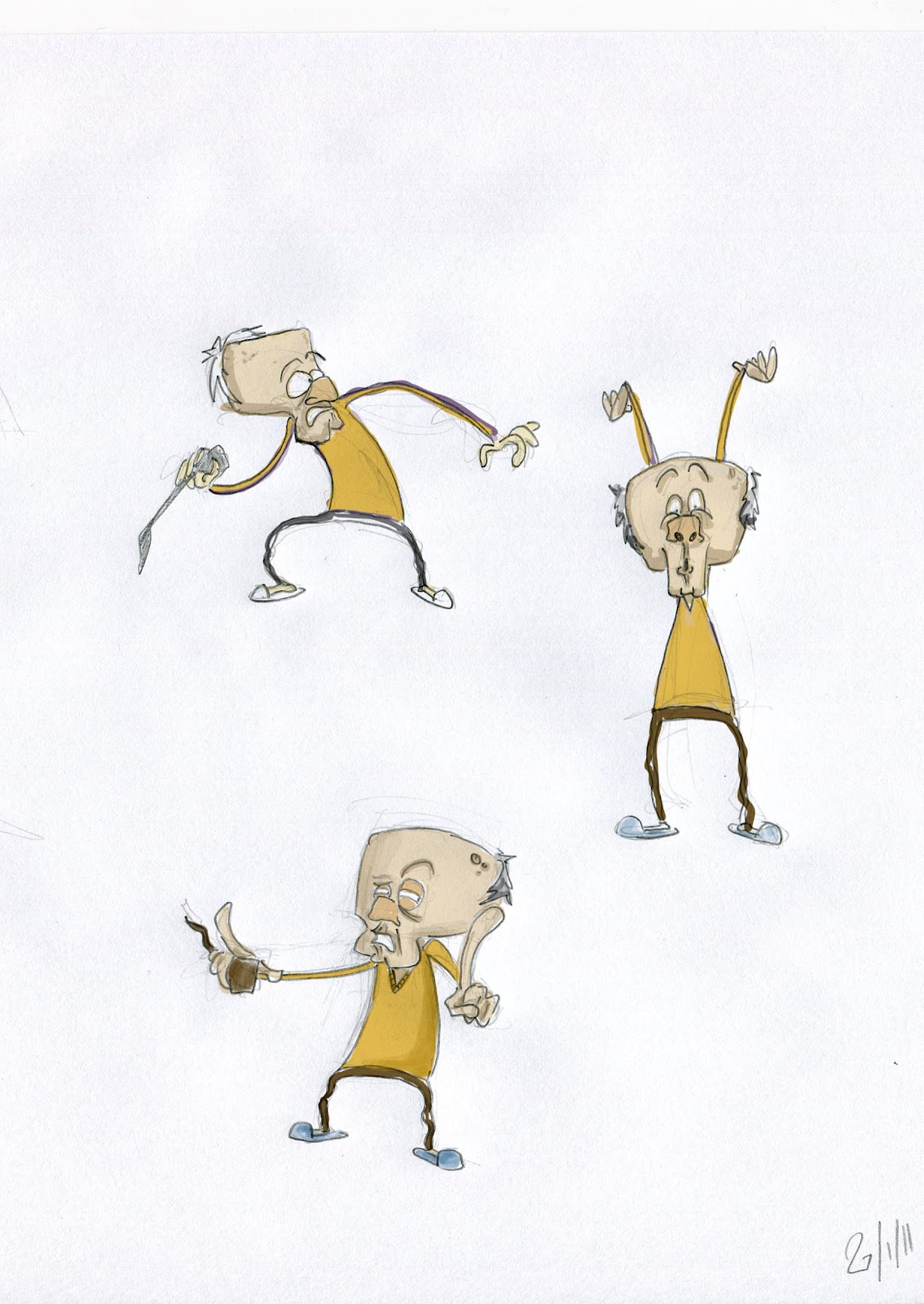
He was going to be called Vivian Maguire, but I've decided to go with the milkman idea, and develop that further, we think it has more potential.
Goodbye Vivian!
Friday, 28 January 2011
Character Design | 6 | Ideas...2
Instead of drawing/ doodling etc i though i'd think about jobs and see if a character could come out of what jobs i thought of.
I wanted to think of obscure jobs, something unique etc where do you start with something like this? Job center plus?...
...I work as a cashier at a tesco's, once i had a kid who watched me scan stuff through the till in awe and then after about a minuet of watching stuff 'beep' past the scanner, he said this to his mum, "i want to be a checkout man when i grow up" then, not even a second later he said "no, wait, i wanna be a super hero with fire hands!!!" and with that, he zoomed around the store pretending to shoot fire out of his hands at other customers...
...with this in mind, instead of going to look at jobs at the job center, i though i'd look at what kids want to be when they grow up. Everyone wants to be something really extravagant or something really random when there, like, 4 - 5 years old.
here's some of the crazy and also realistic jobs kids want to go into...
1. astronaut
2. doctor (boring!)
3. vet
4. footballer
5. train driver
6. farmer
7. ping pong player
8. zoo person
9. a pirate
10. cowboy
11. fire fighter
12. police
13. pilot
(this article is pretty entertaining, it has pictures and everything...even kids spelling mistakes)
The idea
My initial idea was to look at creating a character who was in there teenage years, but once i thought about jobs it made me think, why not turn the whole thing upside down and have the character middle aged?
How can children relate to a middle aged man or woman though?
(not thought of a name yet so) ...............is a child in a adults body, his dream of becoming a milkman as a young boy, came true. He drives around in his milk float delivering eggs, milk and other stuff, to the people of the town.
But, like every other kid, he changes his mind, he's influenced by what he sees on television and in the movie, and now he wants to be a cowboy.
Living in the city is a thousand miles away from the wild west, so with his child like mind and job as a milk man, he'll just have to imagine it.
so, this guy is made up of the characteristics of kids but on top of this, he got the job of his dreams. Kinda like a kid in a adults body. kids could relate to this because this is them 30 years down the line...if they keep the same mind set.
Here's some drawings...


I wanted to think of obscure jobs, something unique etc where do you start with something like this? Job center plus?...
...I work as a cashier at a tesco's, once i had a kid who watched me scan stuff through the till in awe and then after about a minuet of watching stuff 'beep' past the scanner, he said this to his mum, "i want to be a checkout man when i grow up" then, not even a second later he said "no, wait, i wanna be a super hero with fire hands!!!" and with that, he zoomed around the store pretending to shoot fire out of his hands at other customers...
...with this in mind, instead of going to look at jobs at the job center, i though i'd look at what kids want to be when they grow up. Everyone wants to be something really extravagant or something really random when there, like, 4 - 5 years old.
here's some of the crazy and also realistic jobs kids want to go into...
1. astronaut
2. doctor (boring!)
3. vet
4. footballer
5. train driver
6. farmer
7. ping pong player
8. zoo person
9. a pirate
10. cowboy
11. fire fighter
12. police
13. pilot
(this article is pretty entertaining, it has pictures and everything...even kids spelling mistakes)
The idea
My initial idea was to look at creating a character who was in there teenage years, but once i thought about jobs it made me think, why not turn the whole thing upside down and have the character middle aged?
How can children relate to a middle aged man or woman though?
(not thought of a name yet so) ...............is a child in a adults body, his dream of becoming a milkman as a young boy, came true. He drives around in his milk float delivering eggs, milk and other stuff, to the people of the town.
But, like every other kid, he changes his mind, he's influenced by what he sees on television and in the movie, and now he wants to be a cowboy.
Living in the city is a thousand miles away from the wild west, so with his child like mind and job as a milk man, he'll just have to imagine it.
so, this guy is made up of the characteristics of kids but on top of this, he got the job of his dreams. Kinda like a kid in a adults body. kids could relate to this because this is them 30 years down the line...if they keep the same mind set.
Here's some drawings...


Subscribe to:
Posts (Atom)