Since my final major project deadline I've been thinking what i can do next...as well as having a break.
I decided to start a new sketchbook and think of something/ a subject I could work on which would involve doing short animations, 10 - 20 seconds long, so i can explore different things within layout, composition, colour, animaiton principals, different styles and the software i use to create them.
The main topic which crept up was 'Waiting' as that's what I'm doing at the moment, waiting for my degree show and marks! I came up with a huge list of places people wait, obvious and obscure and thought I'd work on them until I get bored.
I started with the 'bus stop' as I'd been getting them loads lately...
This is how I wanted it to look once I'd done a few sketches and observations from standing at loads of bus stops
This is how it turned out..
It was refreshing working on this piece, it was quick to do and picked up on a good few new skills in after effects on the way.
Showing posts with label Research. Show all posts
Friday, 1 June 2012
Tuesday, 8 May 2012
FMP | Facebook
As well as having group crits every other week to get feed back on our progress, we've all been keeping in touch via a facebook group.
Its been good for many reasons, getting instant feedback if you don't want to wait till uni, also when people are just searching the web, they may find something which will relate to someones project, in which case we can just post it on the group.
Its kept the creative flow going throughout the whole semester...
It started off with posts on general stuff and people posting links to things which might help with research towards peoples projects
People wanted feedback on PDP elements of the course
During the later part of the semester, people wanted feedback on tests and were asking technical questions...
And a potato for dave...
Labels:
Final Major Project,
Ideas generation,
Industry,
PDP - Y3,
Research,
style frames
FMP | Title Shot
I made a big deal in my animatic that my title will be embedded into the animation after a couple of shots, this meant I had to make sure I, firstly, have a title for the piece and secondly it will looks nice and feels part of the animation.
Becasue the first section (before the title) is suppose to be the day before, i thought it would be good to have a sort of time lapse of the sky going from night to day, then back to night. During this shhot the title will come up.
So heres some references for the shot...
The main thing I took from these videos is the way the stars move because of the turning of the earth. also, the amount of stars there are out there. Lastly, the colour changes as the sun rises ad falls.
Becasue the first section (before the title) is suppose to be the day before, i thought it would be good to have a sort of time lapse of the sky going from night to day, then back to night. During this shhot the title will come up.
So heres some references for the shot...
The main thing I took from these videos is the way the stars move because of the turning of the earth. also, the amount of stars there are out there. Lastly, the colour changes as the sun rises ad falls.
Wednesday, 11 April 2012
FMP | Afterlife
This is how I picture the afterlife/ underworld of my animation. All done in Black and white to give total contrast from the 'real world', but still keep the same style of animation...looping two frames when there's no movement, you can see it in the piece of animation above.
Also, from watching the link below (sorry, i can't embed it for some reason) I want to add a bit of weirdness/ quirkiness to the scene. By this I mean distorting the characters at certain points, you can see it happening in the piece below at around 1minute 56 seconds.
http://www.animateprojects.org/films/by_date/1995_98/3
Also, from watching the link below (sorry, i can't embed it for some reason) I want to add a bit of weirdness/ quirkiness to the scene. By this I mean distorting the characters at certain points, you can see it happening in the piece below at around 1minute 56 seconds.
http://www.animateprojects.org/films/by_date/1995_98/3
Labels:
Final Major Project,
Ideas generation,
PDP - Y3,
Random,
Research
Thursday, 5 April 2012
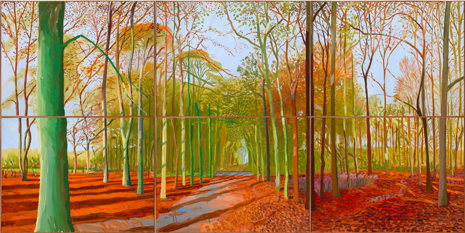
David Hockney Exhibition in London
Whilst in London I went to go see David Hockney's The Bigger Picture exhibition. My Mum and Dad had been just a week before and really enjoyed it (these are two people who couldn't be less interested in exhibitions normally) They even brought back a book of postcards from it....they were well good.
So I was pretty excited about going to the exhibition. When i got there I wasn't too excited about queuing up for an hour and a half. Once I was in there, it was a case of fighting through the crowds to make your way round the whole exhibit.
This is the exhibition (above), imagine that but with loads more people...The work was great though, I had a different opinion on the paintings when i saw them up close from when i saw them far away. As I said out loud to Jack and John "you can really see his imperfections when you get right up close", although i was saying it in an arty voice to humor Jack and John a woman agreed with me and I ended up having a lengthy conversation with her about the paintings, so i had to keep up the persona for a while longer.
My fascination with colour in work meant that i was able to appreciate the work more than i would have done this time last year. The colours were just fantastic. he'd done so many pieces of work for the exhibition as well, and no two were the same, each were done with a different colour pallet.
It gave me so much inspiration for my own work, not really for my Final Major Project, but for what ever work I do in the future. I really want the book now.
Tuesday, 6 March 2012
FMP | Animation Style
My way of animating has developed due to the time constraints of the projects we get at university. I really enjoy frame by frame animation, but its so time consuming. But from watching loads of animations over the past 3 years i've managed to home in on a type of animation which I think works but doesn't require too much of my time, well sort of.
This animation by Dylan Forman starts to show how holding on a pose isn't too bad. Also, stretching the character within the inbetweens is something which I did a little of in the feelgood birds animation, but I think I can take it to the next step and really emphasize the stretches within my new animation, but I need to be aware that if the background doesn't have a looseness to them, it would look out of place. At the moment i plan on having the backgrounds quite loosely done, but if it gradually changes, i need to be aware of that before i start exaggerating the stretches.
This is another animation by Dylan Forman...
Again, there's lots of limited animation in there, but its real fast pace, which works well for limited animation as the faster the movement, the less frames are needed. I need to keep this in mind for my animation. There are slow bits within my piece, so i need to make sure i keep the frames to a small amount, but be weary that it doesn't look lazy or crap.
Lastly this animation by a US based studio called BUCK
There's actually a lot of frames and fluidity within the main character in this ad, but its the background character which I'm focused on; The busker and the bin man. You can tell there's less frames involved in their movement, maybe because there not the main vocal point of the piece and they can get away with looking a bit jittery, but I think it works well and feel even if they were the main character it wouldn't look too bad!
This animation by Dylan Forman starts to show how holding on a pose isn't too bad. Also, stretching the character within the inbetweens is something which I did a little of in the feelgood birds animation, but I think I can take it to the next step and really emphasize the stretches within my new animation, but I need to be aware that if the background doesn't have a looseness to them, it would look out of place. At the moment i plan on having the backgrounds quite loosely done, but if it gradually changes, i need to be aware of that before i start exaggerating the stretches.
This is another animation by Dylan Forman...
Again, there's lots of limited animation in there, but its real fast pace, which works well for limited animation as the faster the movement, the less frames are needed. I need to keep this in mind for my animation. There are slow bits within my piece, so i need to make sure i keep the frames to a small amount, but be weary that it doesn't look lazy or crap.
Lastly this animation by a US based studio called BUCK
There's actually a lot of frames and fluidity within the main character in this ad, but its the background character which I'm focused on; The busker and the bin man. You can tell there's less frames involved in their movement, maybe because there not the main vocal point of the piece and they can get away with looking a bit jittery, but I think it works well and feel even if they were the main character it wouldn't look too bad!
Monday, 20 February 2012
Sunday, 19 February 2012
Setting | Canada + Pat the Adventurer
I decided a while back that my animation would be set in the lovely Canada. I wanted to pick a place where Native Americans actually inhabited (which was mostly everywhere) but also somewhere which I'd enjoy to research more into. I've never really payed much attention to Canada really, but once I'd started looking up certain areas around America, it didn't take long for me to realize that it was a beautiful place to set the animation.
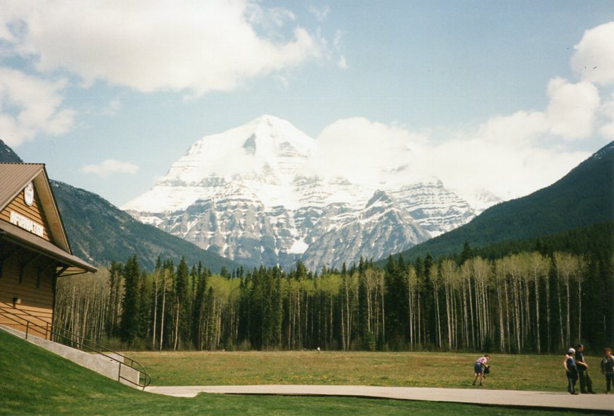
I got a few images off flicker to help me at first, until I was explaining to my grandma (Patricia Burns, but we call her Pat) what I was doing for my final major project...next time I saw her she'd got out her photo album form when she went there her self, plus a book she'd bought whilst there with loads of photographs of the Canadian Rockies.
These pictures have informing me on the look of the piece, making it look hopefully like the Canadian woodlands and great lakes. Specifically looking at the trees, the rocks and the mountains. Also, when looking at the just book, the night time scenes.
First the book...
I liked the mirror image created in this photo, could be good when looking at transition between the real world and the after life
Now Pat's pictures
Thanks go out to Pat for all the help...here she is running out out a helicopter...
I got a few images off flicker to help me at first, until I was explaining to my grandma (Patricia Burns, but we call her Pat) what I was doing for my final major project...next time I saw her she'd got out her photo album form when she went there her self, plus a book she'd bought whilst there with loads of photographs of the Canadian Rockies.
These pictures have informing me on the look of the piece, making it look hopefully like the Canadian woodlands and great lakes. Specifically looking at the trees, the rocks and the mountains. Also, when looking at the just book, the night time scenes.
First the book...
I liked the mirror image created in this photo, could be good when looking at transition between the real world and the after life
Now Pat's pictures
Thanks go out to Pat for all the help...here she is running out out a helicopter...
Subscribe to:
Posts (Atom)