Me, Jack Maguire and John Hind went to visit Beakus studio last Wednesday whilst in London, arranged by John, I showed three pieces of work to Steve Smith and Eleni O'Keeffe who kindly took the time out to see us.
I showed my Train Animation and Feelgood, the main bit of feedback I got, which applies to both, was that their too long for what they are. Feelgood should be shorter because it needs to be short and snappy as its advertizing a product whilst the Train Animation should be cut due to its lack of story. I've been told this a few times now, and as a result I'm making sure my FMP is the right amount of time for what it is.
It was said for both pieces that my design work is really good. This was nice to hear as its something I've been working on to improve.
Lastly I showed my FMP animatic. It was really hard to do, as I had to sit there and explain the concept and it always makes me embarrassed, but I think its essential to do it and I just have to get over it.
It was good to show though, as I got a fresh pair of eye on it. The main thing brought up by Steve and Eleni was that there needs to be more of a reason for the Kid to scare the Bear, which is something I never considered, but it makes perfect sense now. I few suggestions were given which I went away and thought about and have now added to the animatic. Its added more work, but i think its work which is essential to the story.
Aslo, showed this piece which I did with jack. We described what it was for and why we did what we did. As a result they both understood it and had no comment on it...which was a good thing!

Showing posts with label colour. Show all posts
Showing posts with label colour. Show all posts
Sunday, 25 March 2012

Tuesday, 6 March 2012

Wednesday, 15 February 2012


Character Design | Kid
I didn't know whether my secondary characeter was going to be a male of a female, at first it was a young boy, but then i thought it would be good to have a little girl who looked like Wednesday from 'The Adams Family'...
 But then after a bit I went back to a young boy character....I didn't take long for me to make the decision to switch back, as soon as I started drawing, it lent towards a male character. Here's some initial thoughts...


I liked this guys head (below)


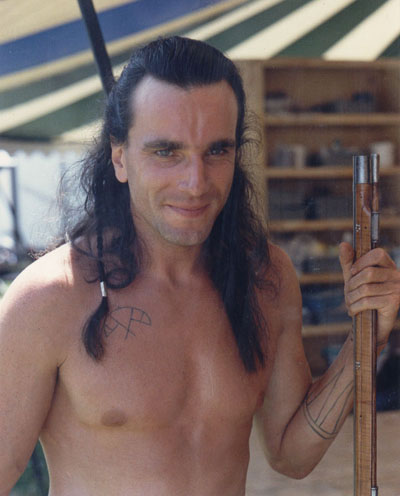

I liked the hair behind the ears, and the large forehead.

So I started to experiment with adding these features to my character, sort of making a younger version of the character from the film.

I began to think that the drawings I was doing (represented in the above image) we going 'too young' almost baby like. Once i drew two characters of different ages, I made the decision it should be somewhere in between (shown below)


I liked this guys head (below)

Whilst eating cereal in the morning, before uni, I've been watching the film 'Last Of The Mohicans', it was on channel five recently and was told to watch it...It was really good, didn't really get too much inspration from in involving Native Americans and their beliefs, but I did like the main character (Played by Danial Day-Lewis) and thought it would be good to take some of his features and add it to my character...
I liked the hair behind the ears, and the large forehead.
So I started to experiment with adding these features to my character, sort of making a younger version of the character from the film.

I began to think that the drawings I was doing (represented in the above image) we going 'too young' almost baby like. Once i drew two characters of different ages, I made the decision it should be somewhere in between (shown below)


I'll add more soon...
Here's a coloured version of him up to now.

Tuesday, 10 January 2012
Photoshop Painting
I watched the video above, and got inspired to mess around with the painting tools in photoshop...its actually very relaxing.
Anyway, I did this. You may remember it from the last post...

I'm going to carry on messing with the paint ...

Sunday, 20 November 2011
Colour Tests for Competition Brief
One thing which I feel I've made more of an effort to do in the 3rd year is make sure the colour in my animations look reasonably good, or visually ok. I really enjoy thinking about colours for my animation, taking into consideration all the different things which will essentially make up the animation; the mood, the style, target audience etc...
The company 'Feel Good Drinks' already have a colour scheme and a style on there website, and although its good, i wanted to create something different which was my own, but still in keeping with their message.
To get inspiration for the colour i looked to my book shelf, which is ever growing. I homed in on the pixar 'art of' books and also one of the disney archive series volumes called 'Design' which showes off some fantastic works of art from the disney artists.

This was the first one I did (below), it was pretty dull, but were the colours I essentially wanted to use; Greens, Blues and Browns.


More Autumn looking...brighter colours, but its looking too realistic...

Birds n' all in this one...

I liked this one (below), but my problem with it was that it wasn't really the right colours for the brief. I imagined it more summery, I'd been rearing off into the autumn look too much.

This was looking less real and more stylized and the colours were much brighter in contrast to the first attempt. But I wasn't happy with the colour.

I got bored with the 'in a tree looking out' composition and decided to look at the tree to see if I could get any good colours out of it. I liked the green sky which was influenced by a few pieces of art i'd seen from my books of reference (which are shown below my image)


I finally settled for this....its bright enough and looks pretty spring/ summery. also I made the branches/ tree trunks a dark green and totally got rid of the browns, it seemed to work better. Now i needed to do this, but inside the tree where the animation will take place, and also consider the composition.

Friday, 28 October 2011

Sunday, 11 September 2011
Monday, 29 August 2011


Tuesday, 9 August 2011
Work Experience at LOVE Creative
As well as writing about the work experience, I'll have to write about the project I got from Uni over the summer(Self Initiated), as it all mixes into one....like a cake.

SOOO, from 31st May till 24th June I was commuting to and from Manchester every Tuesday, Wednesday, Thursday and Friday to a studio called LOVE Creative. I was there with three other people from Stockport College; Helen Porter (Graphic Design), Dominique Byron (Illustration) and Jack Maguire (Moving Image).Me and Jack are working on a short animation (and have been doing since September last year) so that's what we were working on whilst in the studio. As well as working on this short animation, we were also given some after effects work to do at some points.
Starting from the end...me and jack helped out Dominique bring one of her illustrations to life, this was nice for two reasons; firstly it meant it could put our after effects skills to the test and secondly it was nice to use someone elses work which looked really cool.
We failed at putting our after effects skills to the test as something that should have taken a few hours to do ended up taking....3 days (well not all of the day...more like 3 hours each day) never the less, I had fun helping out where I could. Here's Dom's animation...
A third thing that's nice about working with an illustrators work is that they know how to use colour and composition well, which is something I have been looking into for the Self Initiated project from Uni.
So, to start thinking more about colour, my aim was to get started on a colour script for mine and jack's animation. To give a brief out line to what the vision is, we want to get across the feelings of two characters in a relationship, by using the seasons, for example; the animation will start in spring as spring is known as the season of new life etc also, we go through eight seasons all together and as the relationship turns sour, the seasons should mimic this.
These are two which I did whilst at LOVE creative, both autumn...but as the relationship changes over time, when we go back to autumn the next time round and its much bleaker...

 I hope the above makes seance. As well as this going towards a side project, its also helping me on my self initiated.

Some Pictures from our time at LOVE Creative...


SOOO, from 31st May till 24th June I was commuting to and from Manchester every Tuesday, Wednesday, Thursday and Friday to a studio called LOVE Creative. I was there with three other people from Stockport College; Helen Porter (Graphic Design), Dominique Byron (Illustration) and Jack Maguire (Moving Image).Me and Jack are working on a short animation (and have been doing since September last year) so that's what we were working on whilst in the studio. As well as working on this short animation, we were also given some after effects work to do at some points.
Starting from the end...me and jack helped out Dominique bring one of her illustrations to life, this was nice for two reasons; firstly it meant it could put our after effects skills to the test and secondly it was nice to use someone elses work which looked really cool.
We failed at putting our after effects skills to the test as something that should have taken a few hours to do ended up taking....3 days (well not all of the day...more like 3 hours each day) never the less, I had fun helping out where I could. Here's Dom's animation...
A third thing that's nice about working with an illustrators work is that they know how to use colour and composition well, which is something I have been looking into for the Self Initiated project from Uni.
So, to start thinking more about colour, my aim was to get started on a colour script for mine and jack's animation. To give a brief out line to what the vision is, we want to get across the feelings of two characters in a relationship, by using the seasons, for example; the animation will start in spring as spring is known as the season of new life etc also, we go through eight seasons all together and as the relationship turns sour, the seasons should mimic this.
These are two which I did whilst at LOVE creative, both autumn...but as the relationship changes over time, when we go back to autumn the next time round and its much bleaker...

 I hope the above makes seance. As well as this going towards a side project, its also helping me on my self initiated.
Because I'm new to all this, my first lot of colours are always very unambitious, but its only till you TRY another set of colours, then you realize how bad the first set were. So one thing I learnt was to not be satisfied with the first outcome.

Also use of the 'Hue and Saturation' tool in Photoshop helped out a lot, you can take the colours your happy with and make then really vibrant or really saturated in an instant. (that how i got the really vibrant orangey/red on the first autumn)
In terms of moving image stuff done at LOVE Creative, I did 2 seconds worth (I could well be exaggerating) but yer...here's the reference footage of Jack and me trying to sit down on a sofa....
I think I ended up using some refrence footage I did at home, but i can't find it, here's the test...
Also, my after effects skills also got a lot better from having some briefs of the LOVE creative team...but I can't talk or even show them. So i could just be lying to you, but I'm not...honest.
Lastly, I never thought of having twitter, it seemed too complicated and never really interested me. But from talking to jack, dom and the people at LOVE creative, everyone said its a really good way of getting your work seen and also a nice way to keep in touch. So me, and also Helen, joined up. It seems like a good way to promote your stuff....follow me, please
I also joined LinkedIn and Behance Network.
To sum up, its been really good working at LOVE Creative, did some nice collaborative work, learning more about colour, got more work done on the short animation and got more connected by signing up to loads of websites.
To sum up, its been really good working at LOVE Creative, did some nice collaborative work, learning more about colour, got more work done on the short animation and got more connected by signing up to loads of websites.
Some Pictures from our time at LOVE Creative...


Subscribe to:
Posts (Atom)